UX Case Study

WaFd Bank

Project Overview

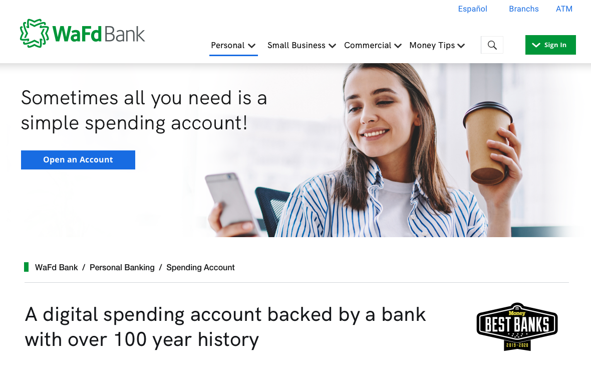
Washington Federal, being regulated from opening any new branches, began a 'Digital First' strategy. This vision 2025 plan included growing deposits through new features, new products, apps and improved digital experiences.

To be successful, Washington Federal had to drop it's old brand, and antiquated 3rd party application portfolio.

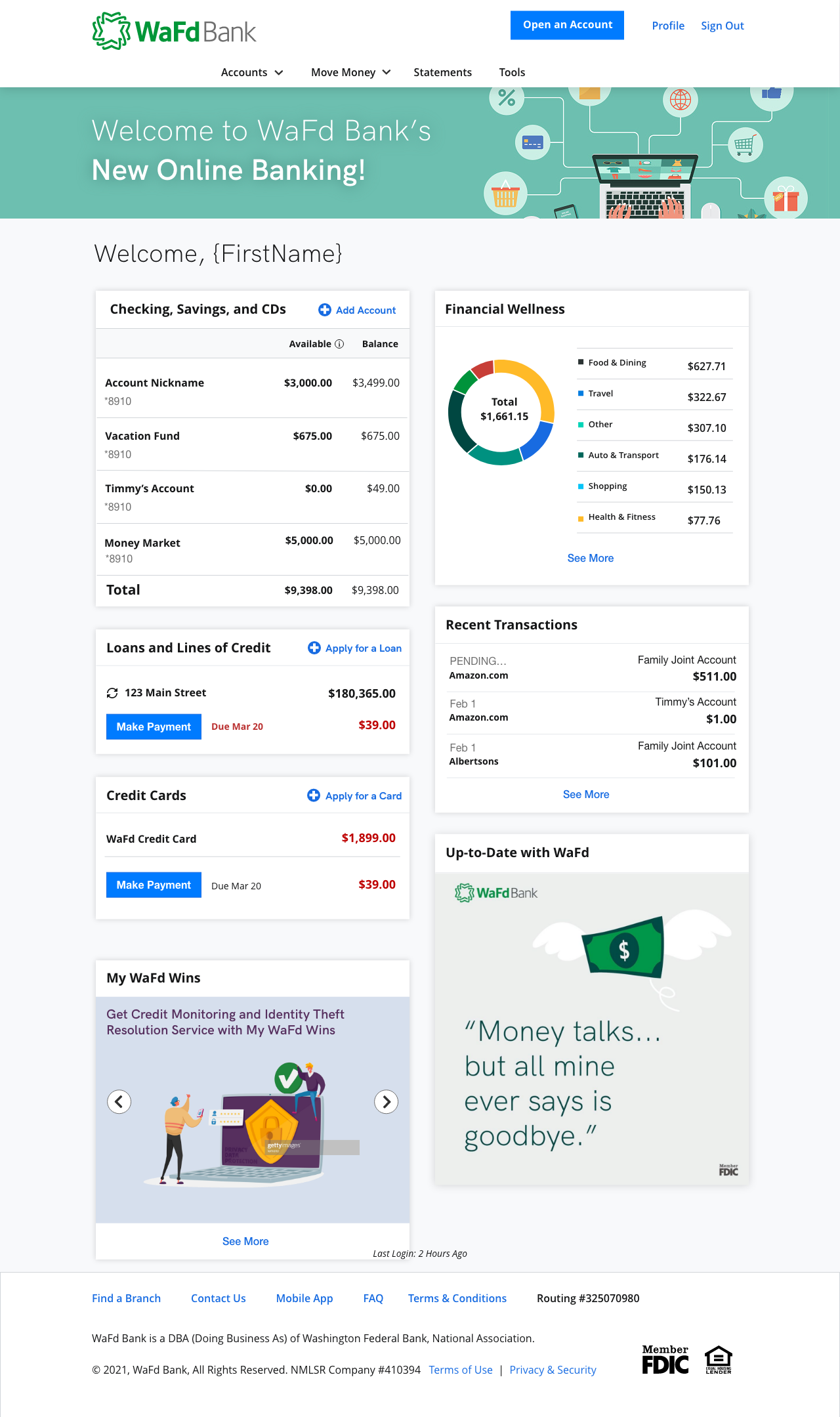
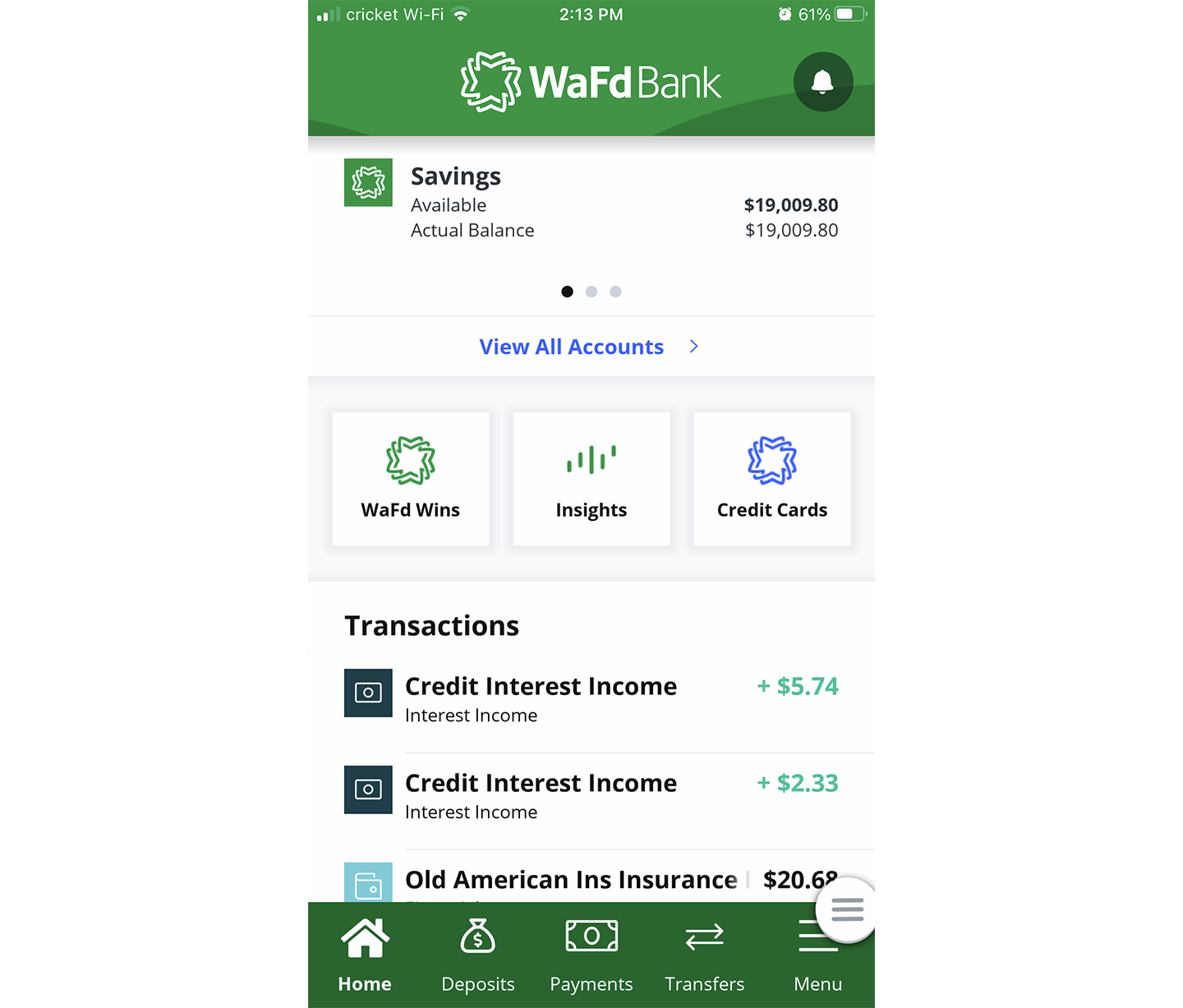
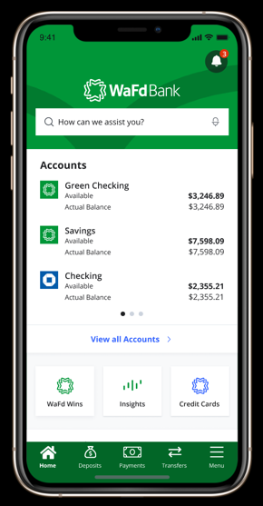
This case study shows the successful development of the Brand and redesign of digital assets.
Responsibilities

As Director of Design I was in charge of the product roadmap, information architecture, digital branding, style guide, product strategy, wireframes, usability testing, and crafting the final designs.

Roles

  • UI/UX Design
  • Usability Testing
  • Wire Framing
  • Information Architecture
  • Competitive Research
  • UI Design
  • Creative Direction

Tech

  • Sketch
  • Figma
  • Adobe XD
  • Mendix
  • HTML, SCSS
  • Jira

Empathize, Define, Ideate, Prototype, and Test.

Stage 1: Discovery and Research

This step involves understanding the target users, their needs, preferences, and pain points. It may include user interviews, surveys, market analysis, and competitor research.

Washington Federal's customers helped define a large number of UX errors that needed to be addressed immediately.

I fixed a numerous information architecture and product design issues.

  • Long drill-down navigation
  • A location request dialog poped up on every page
  • Confusing login with business banking jump menu that looked related to username
  • Un-relatable invested here tagline
  • Poor quality responsive design
  • Redundant 'Nearest branch' and 'Locations'

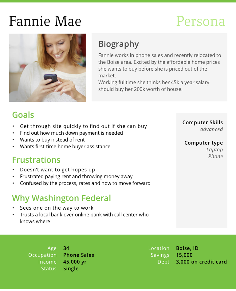
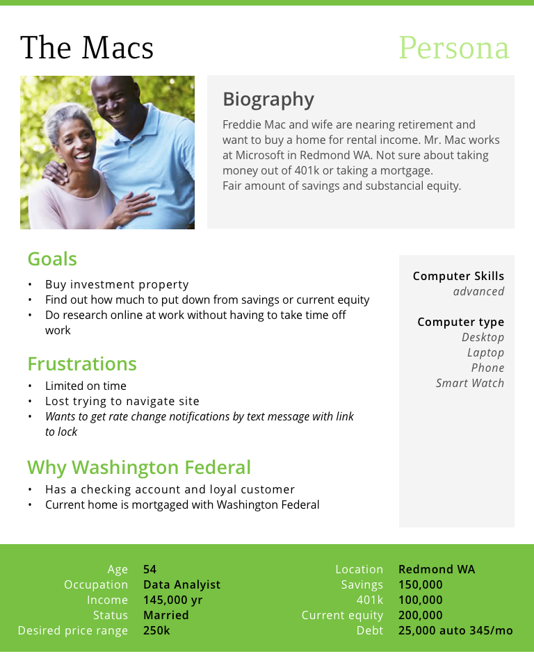
Stage 2: Empathize—Research Your Users’ Needs and Develop Personas

Understand the customer, their mindset and how they use the products. What is their emotional state and outcome?

I analyzed recorded sessions and heatmaps in hotjar, as well as customer demographic information to develop personas.

Define—State Your Users' Needs and Problems

"People need a better understanding of where their money is going each month"

"People want to better understand the fees and costs of doing banking"

"People want to feel like they are banking locally and trust the staff"

"People want to easily sent money to friend and family and manage household budgets"

Stage 3: Journey Mapping

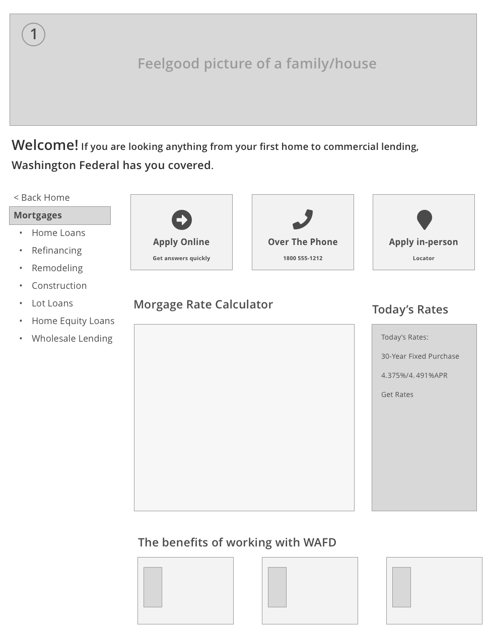
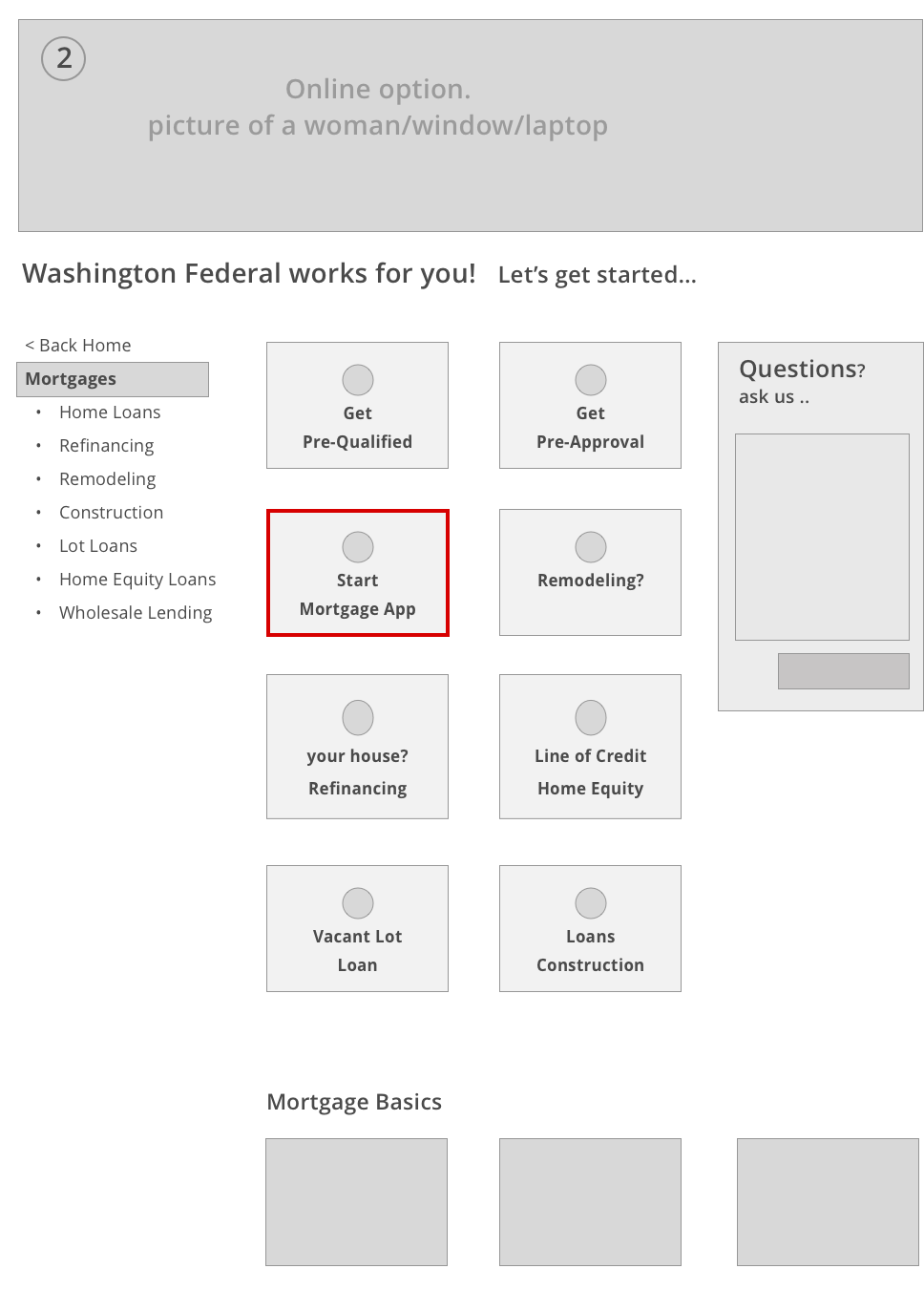
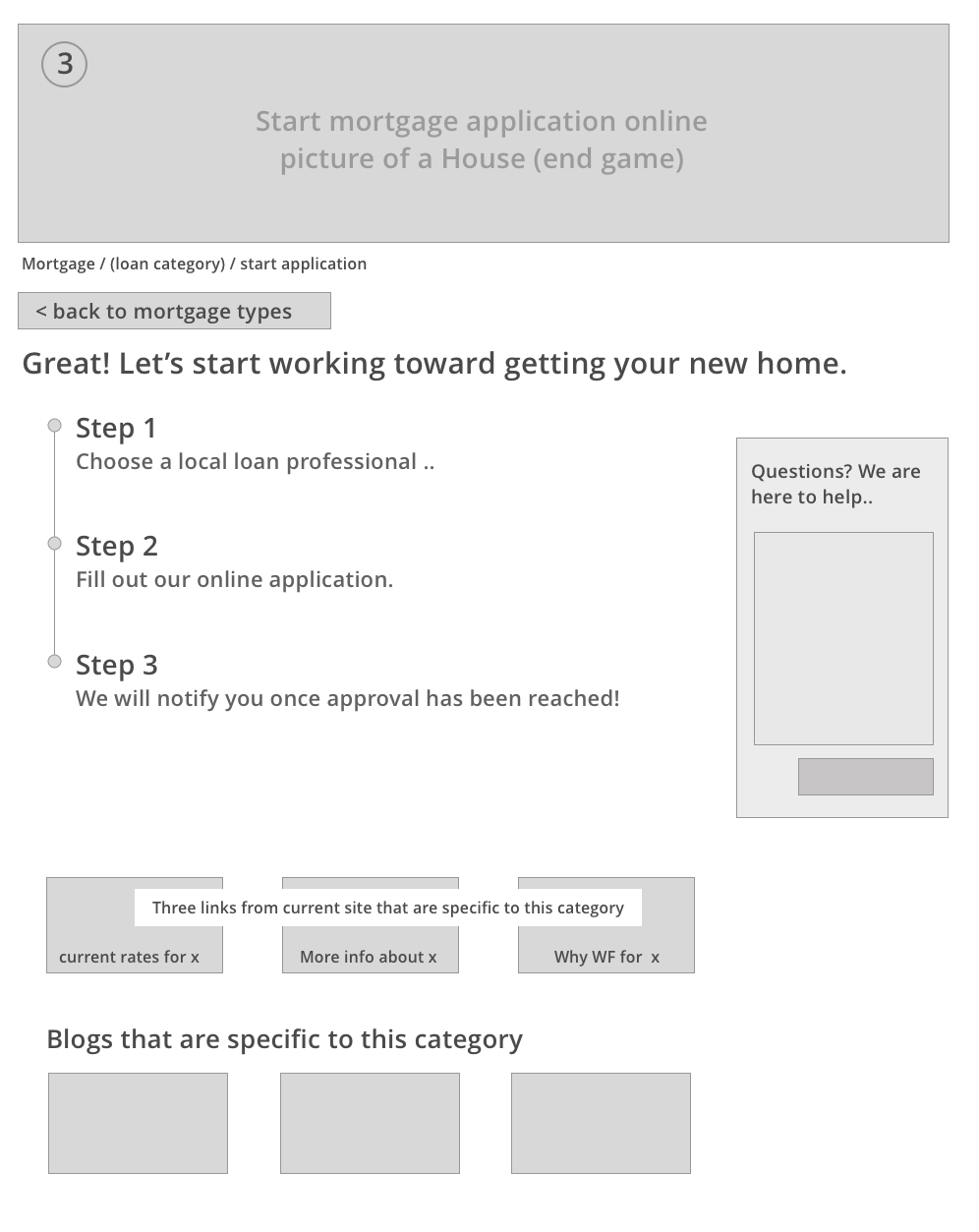
Stage 4: Wireframeing

Outlined the functionality and flow of the product.

Stage 6: Usability Testing

I Observed users interact with the online banking and Website prototypes to identify usability issues, pain points, and areas for improvement.

Stage 7: Iteration and Refinement

Based on the feedback received during usability testing, I iterated on the designs making improvements and refinements to address the defined concerns and enhanced the experience.